
Strategy and Goals
Performance indicators dashboard: how to create yours
See what a performance indicators dashboard is, how it relates to KPIs and visual management, its benefits and how to create yours.
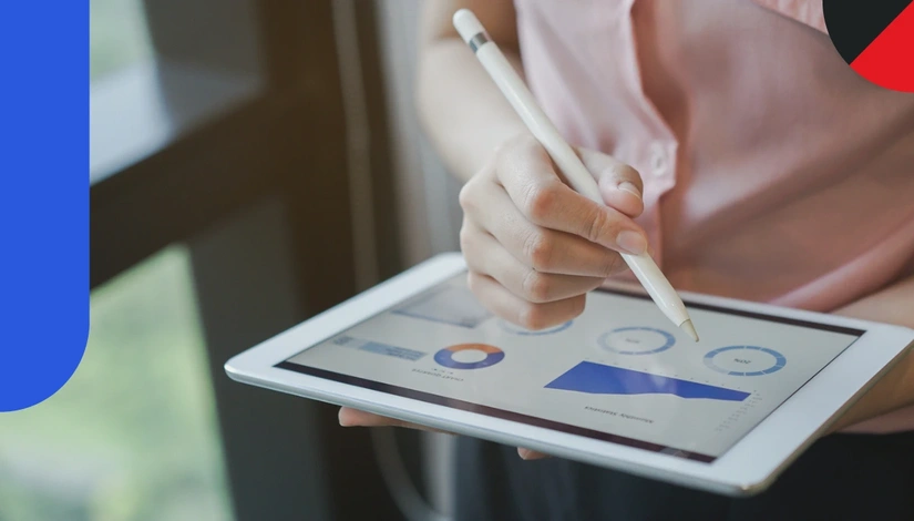
Key indicators are essential business metrics. With them, the company sets where it wants to go, and the performance indicators dashboard makes the path easier.
The dashboard brings all KPIs (Key Performance Indicators) together in one place and shows how different processes evolve, side by side.
In this article, you will see what a performance indicators dashboard is, its main benefits and how to create one for your business.
Definition of a performance indicators dashboard
A dashboardopens in a new tab of performance indicators is a tool that lets you monitor, in real time, the progress and evolution of demands and projects. Leaders and employees get clear, objective access to data on the company’s management and performance.
It can be displayed on a wall, a board, a TV or another format, as long as it sits where everyone can see it easily.
With this quick view, employees see what works and what needs fixing. From there, managers make the changes needed to reach the objectives set.
The idea of a KPI dashboard is to share the indicators that measure the success of different processes and make clear what matters to management. The tool promotes engagement, saves time and resources and keeps everyone focused on better performance.
Dashboard and visual management
The performance indicators dashboard, also called an indicators board, enables visual management of the company’s situation. The proposal is that all employees follow the progress of the effort and know how much is left to reach the goals.
That is why you should place the indicators board in a strategic location, where everyone sees the results and KPIs. This raises engagement, because each person sees more clearly how their own work and the team’s are going.
Difference between KPIs and a dashboard
KPIs and dashboards are related but have different purposes. A KPI is a metric used to assess the performance of companies, departments, projects or processes against objectives. A dashboard is a visual tool that shows the important metrics in an easy-to-understand way.
KPIs are chosen to represent critical aspects that need to improve and, on the dashboard, become visually accessible to the whole team. A sales team KPI can be “sales closed per month”, and a customer support KPI, “first-contact resolution rate”.
On the dashboard, these KPIs appear easily, with a view of current performance and history, and managers decide with more information. KPIs are the individual metrics that track performance, and the dashboard compiles and presents those metrics in a useful, accessible format.
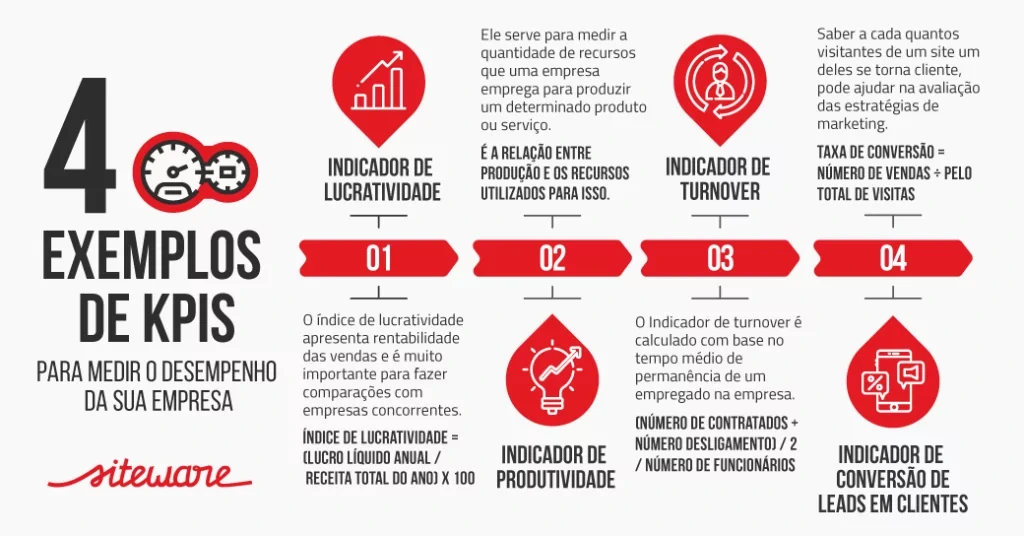
See 4 examples of KPIs:
Read also: how to measure performance indicators: 4 tips
E-book: individual goals and KPIs
See how to break goals down with individual performance indicators (e-book in Portuguese).
Benefits of the indicators dashboard
The main benefit of the dashboard is that the team sees how smaller objectives contribute to bigger ones and quickly checks the performance of an area that affects the organization’s overall results. This helps identify where problems are forming and shows how to improve goals and strategies.
Imagine the company wants to raise annual profit by 20%, and the manager asks the sales team for 30 sales of a new product per month. Most of the team hits its goals, but profit is flat.
On the dashboard, the manager notices the rate of repeat customers is falling, which hurts profit. The conclusion is that the team focuses too much on new sales and neglects relationships with existing customers. Loyalty strategies may be the answer.
Data-based decision-making
Dashboards give quick, easy access to important data, and companies decide with more information and more speed. Managers rely on concrete information, which replaces guesswork and intuition.
KPI monitoring
The dashboard lets you monitor key indicators in real time. Tracking quickly shows the areas performing below expectations, and the team fixes problems before they get worse.
Identifying trends and patterns
When you view data on a dashboard, you can spot trends and patterns that stay hidden in raw data. That makes it possible to foresee future problems and find growth opportunities.
Better operational efficiency
The dashboard helps identify inefficiencies, such as processes that take longer than they should or underused resources. As a result, companies tend to improve productivity and profitability.
More transparency and integrated communication
By sharing performance information with every level of the organization, managers make sure everyone is aligned and working toward the same objectives.
Customer focus
Besides internal performance, dashboards track customer metrics, such as customer satisfaction, response time and retention rates. This improves service strategies and strengthens customer loyalty.
What to track on the indicators dashboard
The right tool lets you set up any type or level of data on a dashboard, such as:
- return on investment (ROI);
- store performance;
- tool availability;
- customer service;
- critical issues.
You can also segment the information and update it in real time or periodically, especially if the dashboard comes with a business intelligence tool.
Why use a digital indicators board
Before seeing how to create a performance indicators dashboard, it is worth stressing why it should be digital: the format broadens everyone’s understanding. With specialized software, you can build an interactive board and update it more often. Here are 5 reasons:
Real-time updates
Digital dashboards can connect directly to the company’s data systems and update KPIs and other metrics in real time. Managers and teams access the latest information without waiting for periodic or manual reports, and decisions come faster, with current data.
More integration between teams
Digital indicators boards make it easier to share information. All authorized users access the same set of data, which improves collaboration and alignment. This reduces the risk of inconsistencies and misunderstandings caused by teams working with different data.
Mobile access
Many dashboard platforms are optimized for mobile devices, and users access information anywhere, anytime. Access helps remote teams, managers on the move and quick decisions outside the office.
An intuitive, pleasant platform
Digital dashboards are usually designed with user experience in mind, with charts, colors and interactivity that make data easier to understand. This raises engagement and the chance of data-based decisions.
Qualitative interpretation
KPIs are usually quantitative, but digital dashboards also leave room for qualitative interpretation. Comments or notes attached to specific data let people record insights and context that numbers alone do not capture, which enriches the reading of performance.
How to create an indicators dashboard
Now that you know why to use a digital dashboard, see how to build yours to raise business efficiency.
Step 1: Define the indicators
The first step is to select the indicators relevant to the panel, such as those tied to profitability, customer satisfaction and revenue.
Choose KPIs carefully. Avoid those that are too complex or hard to monitor, and check that they are aligned with the organization’s objectives. For that, see how to create indicators and align KPIs to strategy.
Step 2: Choose the type of dashboard
With KPIs in hand, define the type of dashboard. There are 3 options:
Operational dashboard: covers the performance of the business’s operational activities, the ones that keep the company running day to day. It can bring together data such as number of complaints, total technical support requests and employee absenteeism rate.
Strategic dashboard: shows indicators of the business’s overall performance. It usually brings data relevant to the executive team, such as annual sales volume and average customer satisfaction over a longer period.
Analytical dashboard: offers a broader view of the data collected, to identify specific patterns and trends. At a bank, for example, it can show that 80% of credit card bills are paid on time and 20% are late.
From there, you can identify common factors, understand the causes of the late payments and draw up strategies to reverse the picture.
With this dashboard, you can analyze large volumes of data to investigate trends and forecast results.
Step 3: Use suitable charts
How you represent an indicator’s data directly affects how it is read. Assess which aspects should appear in which types of chart on the KPI dashboard.
If you are comparing two indicators based on each one’s history, for example, bar or line charts usually work better than pie charts.
Step 4: Choose colors well
Colors that are too strong tire the viewer, and employees may set the panel aside. Prefer soft tones with good contrast, to see the limit of each piece of information in the charts.
Opt for a clean look, with no unnecessary elements on the management dashboard.
Step 5: Include alerts
Set the dashboard to signal when an indicator is far from what is expected or when a goal is reached. That way, you are notified when there is a problem along the way or when you are heading in the right direction.
Alerts signal the need to act, even when you or another employee is less attentive.
How to build the dashboard in Stratws
Stratwsopens in a new tab is the management platform created by Siteware that brings indicators together in one place. In it, the feature called Farol is the visual indicators panel, which shows results at different frequencies, compares them with previous years and lets you analyze scenarios and manage risks.
Values enter through the Spreadsheet feature, with permission control by management unit, and appear in the Farol.
A dashboard with each indicator at its source
Each indicator with source, formula, owner and frequency, from corporate to individual.

About the author
Equipe Siteware
Content produced and reviewed by the Siteware team, curated by internal experts in strategic management and corporate performance.